Web design trends 2015
Since 2014 didn't really bring out many new web design trends, it will be interesting to see how 2015 will develop. Based on current developments, we probably shouldn't expect too many web design innovations in 2015 either. It is much more likely that current trends and patterns will continue to prevail and then be further improved.
There is unlikely to be an all-round revolution in web design. However, as the internet is changing at breakneck speed, it will only be a matter of time before the next design revolution is just around the corner.
These are the web design trends currently expected in 2015:
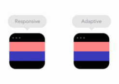
Responsive websites
Already a major trend in web design in 2014, there is no way around responsive websites in 2015. Users surf the Internet on all devices, which is why your website should always be displayed perfectly, regardless of the device. (See also Why use responsive web design).
Flat design and material design
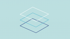
One of the biggest web design themes of 2014 will continue to prevail in 2015. The focus is on minimalist shapes and clear, high-contrast colors. The flat design will be further developed by the term material design coined by Google. Here, the principles of flat design are supplemented by subtle gradients, layers and animations.
Microinteractions
Through simple and fast operation, the user should be encouraged to interact with a website as much as possible. Currently, one of the most frequently used microinteractions in web design is, for example, the request to subscribe to a newsletter. This can be done in a matter of seconds, as the user only has to enter their email address and press the subscribe button.
Infinite Scrolling - Parallax Scrolling - One-Page-Design
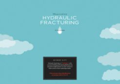
Since many users visit the Internet via touchscreen devices, the trend is increasingly moving towards techniques such as infinite scrolling, Parallax Scrolling or One-Page-Design. Multi-page and nested websites disrupt the surfing behavior of users. Clicking links and buttons is cumbersome and takes longer than scrolling via a touchscreen. In addition, the above-mentioned methods help with storytelling on websites and offer the user a completely new experience.
Card Based Design
Since many users visit the Internet via touchscreen devices, the trend is increasingly moving towards techniques such as infinite scrolling, Parallax Scrolling or One-Page-Design. Multi-page and nested websites disrupt the surfing behavior of users. Clicking links and buttons is cumbersome and takes longer than scrolling via a touchscreen. In addition, the above-mentioned methods help with storytelling on websites and offer the user a completely new experience.
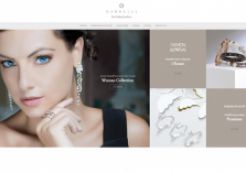
Natural Stock Photography
Already a major trend in web design in 2014. This is why it is sure to continue in 2015. The images run under an open license, so you can use them safely for your own projects. Images that fit any circumstance or situation.

Natural Stock Photography (Brave People)
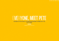
One-Color Dominance
Websites that use only one color as the focal point. Focusing on just one color in your web design adds emphasis and helps customers associate certain colors with your brand.
Video or photo fullscreen backgrounds
Full-screen backgrounds with photos or videos are not necessarily a new method in web design, but will continue to gain ground in 2015. Many one-page sites use this technique to create an appealing design and invite the user to linger. Nested pages also use this technique for their home pages. However, the further development of this web design trend will tend to be limited to the technical aspects. For example, it is very important to offer the user fast loading times despite large and high-resolution images or videos and to ensure an optimal display.
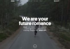
Video fullscreen background (Snask)


