Web design trends 2016
In 2016, there are once again some new but also some ongoing web design trends. We have summarized the most interesting web design trends for 2016.
Material Design
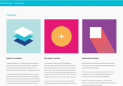
The Material Design introduced by Google in 2015 will continue to spread and develop in 2016. Through shadow effects, movement and depth, content on websites is presented more realistically. The differences between flat and material design are not great. However, material design also uses depth, shadows and movement to create an even better user experience.
Scrollytelling
Last year, this was already a growing trend that will continue this year. Through vertical (sometimes also horizontal) scrolling, the page continues to build up and tells a story. Through the scrolling itself, and the speed at which the user scrolls, they can influence the process.
One-pagers become page carousels
A major trend since last year has been one-page sites. These will change a little this year and increasingly appear as Page Carousels. The content is always displayed in full in the browser. Vertical scrolling then takes the user directly to the next area. The user therefore no longer scrolls between the areas, but changes the areas and sees them displayed in full.
Loading screens
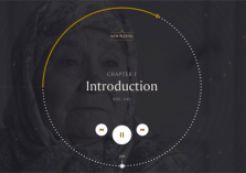
According to statistics, a website should be fully loaded within 3 seconds, otherwise around 40% of users will bounce. However, in times of dynamic websites, which often consist more of JavaScript code than HTML, the resources required are also increasing. loading screens are a great solution to keep users with slow connections (even in 2016, this will still be the case) on your website despite the waiting time. Users are greeted with interesting information or an intro to the website until the page has loaded in the background so that they don't have to wait and bounce again.
SVG and CSS3 animated websites
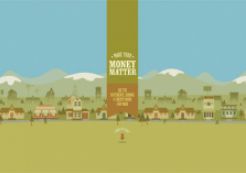
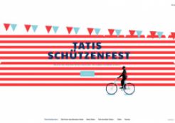
"Those believed dead live longer". This proverb applies very well to a file format that is currently making a comeback: SVG. An old file format that has long been underestimated. Due to modern Retina displays alone, the vector format is now more interesting than ever. It guarantees an optimal, always razor-sharp display of graphics in any size. Another advantage is that SVG paths can be animated with CSS3 without much effort.
In combination, these two trends are definitely a resource-saving alternative to JavaScript frameworks or assets in 2016.
"Fancy fonts"
The days when web designers on the Internet were limited to system fonts are over. With web fonts, designers can finally move away from the standard fonts and improve the look of the website and the user experience with unusual fonts. "Fancy fonts" or "non-traditional fonts" are individual and sometimes very special fonts that match the theme of the website. With web fonts, there are no more limits for designers. Even fonts developed specifically for the website and used as web fonts are no longer a rarity.
Responsive design
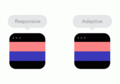
Last but not least: Responsive Design. As users surf the web on an incredible number of different devices and screens, this is one of the most important trends. It is also one of the few trends that can be said with certainty to continue to prevail in the coming years, as it is indispensable for the perfect display of websites on all devices. Find out why you should use responsive design and what you need to pay attention to in our blog article "Why use responsive web design".
In conclusion, it remains to be said that it is not easy to predict web design trends. Trends are often short-lived affairs that disappear just as quickly as they appear. Due to the constant competition for modern websites that stand out from the rest and offer the user the best possible experience, trends develop and change rapidly. Existing trends are often further developed or slightly modified. True to the motto "You have to keep changing, renewing and rejuvenating in order not to become obsolete", we are looking forward to the new trends and are excited to see what surprises the year 2016 has in store for us in the area of web design trends.
... Related articles:
... Sources:


