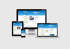
Responsive web design with Drupal
Responsive web design with Drupal
- Date & time: Fri., July 26, 2013 - 6 p.m.
- Location: Technology Center Konstanz (room to be announced depending on the number of participants)
- To register at Xing
The local Drupal User Group
With a local release party for the launch of Drupal 7, the Drupal User Group Bodensee was formed at the same time in January 2011. First in the Meersburg offices of Schindler & Parent, later meetings took place in the neighboring building at Tineon AG. After a longer interruption, we at Tojio now want to revive the activities of the user group. The next meeting will be on the other side of the lake at the Technology Center Constance on Fr., 26.7.2013 at 6 pm.
The topic of the meeting will be: Responsive web design - here, of course, specifically tailored to Drupal. We will first give a general introduction to the topic - both from a design and developer perspective - and will then use concrete examples to highlight the possibilities for implementing a responsive web design with Drupal.
A word in advance about the user group: this group and its meetings are not only aimed at Drupal developers, but also explicitly at designers, marketing specialists, sales people, content managers... etc. pp. In short: anyone who is involved or interested in Drupal in any way is very welcome! Because it is often the perspectives of other disciplines that open your eyes to aspects of your own work that you have not previously considered. In any case, the previous meetings were always inspiring and allowed us all to return to work with fresh ideas in our luggage...

One website for all devices
The topic of Responsive Web Design has been on our minds at Tojio for almost two years now and we have gained some experience and best practices along the way. The aim of responsive web design is to create websites that respond intelligently to the circumstances in which they are displayed. The main factors here are the device class (mobile, tablet, desktop, ...) as well as the resolution and orientation of the screen. Depending on which of these factors are present, the website should be brought into a suitable format in order to ensure the optimal user experience. To achieve this, both design decisions and development strategies should go hand in hand from the outset with regard to the various presentations of a website.
Responsive web design frameworks for Drupal
The frameworks we use in conjunction with Drupal are Omega and Bootstrap. While Omega (3) offers excellent options for configuring layouts in the backend and functionalities for visualizing grids and regions, Bootstrap requires more coding work and more "flying blind", true to the motto "By nerds, for nerds". However, this can be worth it, as Bootstrap offers a wealth of components "out of the box", which makes the creation of prototypes and websites extremely easy in some respects.
We would be delighted to get as many Drupal enthusiasts as possible to this event and to reanimate a lively user group at Lake Constance. On the subject of Lake Constance, let's not just brood in a meeting room on this date in midsummer. Let's enjoy the beauty of the region and round off the Friday evening with a well-earned, cool beer on the shores of Lake Constance!

