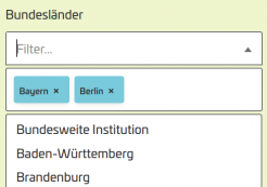
select-improved: an improved select component
We have created a customized select widget specifically for multiple selections at Tojio. The problem with the conventional select element:
- it is very difficult to customize visually
- it can't be filtered (which is particularly annoying for long lists)
- if multiple selection is possible, you can no longer see the selected options after collapsing the list
For the calendar of events for Climate Adaptation Week (hosted by Zentrum KlimaAnpassung - German Climate Adaptation Center), we have added various filter options: above the events, you can filter by the individual days of the week. Below this, behind a "Set filter" button, there is an initially collapsed area with further options for filtering events according to certain criteria (e.g. federal state).
For filters of this type that use long select lists, we have created a strongly improved web component that replaces the native select element.

Our improved select widget: select-improved
Extending the native select element
Our select-improved is a web component that extends the native select element.
class SelectImproved extends HTMLSelectElement {

[...]

}
customElements.define('select-improved', SelectImproved, { extends: 'select' });
Functionality of the component
A web component that extends existing elements is not embedded with its own tag name as usual, but the original element is extended by the attribute is, in which the extension class is specified: <select is="select-improved">This means that we have to change the Twig template in the places that are to use the new element and insert the attribute there (see below).
{% set replacement_info =  'is=select-improved' %}
{{ attach_library('zka/custom-elements-polyfill') }}
{{ attach_library('zka/select-improved') }}

{% apply spaceless %}
  <select{{ attributes }} {{ replacement_info }}>

    {# [...] options as usual  #}

  </select>
{% endapply %}
The extended component takes the options as they are passed to the select element and builds a new, visual representation with filter, list and an area for displaying selected options (for multiple selections) within the shadow root of the component.
Polyfill for browsers that do not support extensions of native elements
Unfortunately, not all browsers (especially not Safari on MacOS / iOS, nor WebView on iOS) support extending existing HTML elements (too bad Apple, Safari used to be a really nice, progressive piece of software). A longer issue in the WebKit project presents the discussion on this.
In order for our custom select element to also work in Safari, a polyfill must be used to enable this functionality in Safari. The polyfill comes from the Ungap project and we define an own library for this purpose, which is loaded first. To ensure that this library is available before a custom element can even be instantiated, we force it to be loaded in the document header:
custom-elements-polyfill:
  version: 1.0
  # it is crucial that this available before any other custom element
  # stuff so move it into the header
  header: true
  js:
    # polyfill needed for safari
    components/select-improved/custom-elements.1.3.0.min.js: { minified: true }

select-improved:
  version: 1.0
  js:
    # definition of the web component
    components/select-improved/select-improved.js: {}
  css:
    theme:
      # this css holds the custom properties to adjust styling
      components/select-improved/select-improved.css: {}
